v1.2.2Clipped dialog icons fixed

A calmer, evenly spaced qBittorrent.

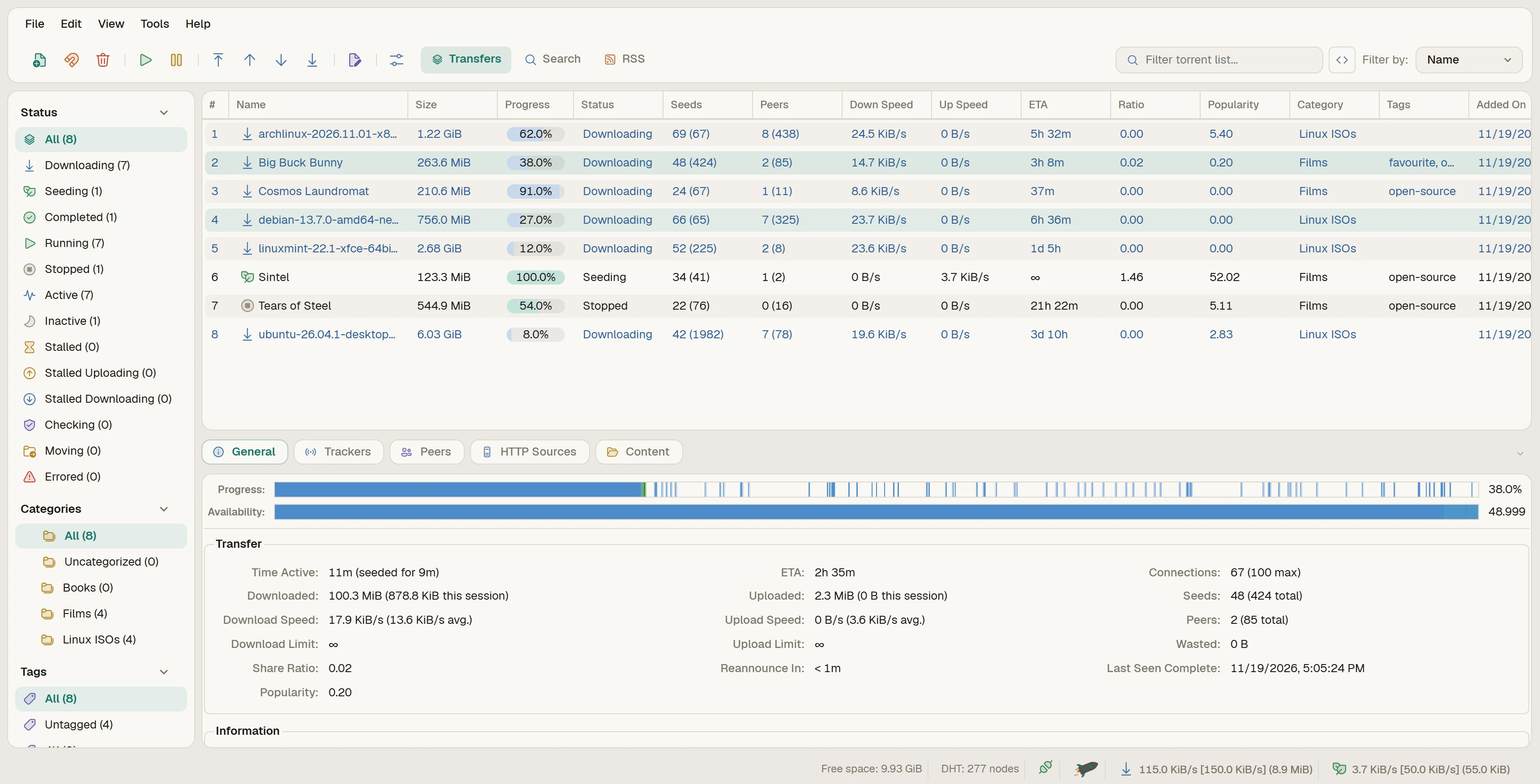
Noorjahan is a light and dark theme for qBittorrent on Windows. It evens out the spacing, swaps the loud toolbar for simple outline icons, and only uses colour when something is actually happening.

For
qBittorrent 5.3, Windows 10 and 11
Schemes
Light and Dark
Icons
Fluent UI, recoloured
Web UI
qBittorrent 5.2.3 and 5.3.0, Windows and Linux
Price
Free
Named after
My mother
01Pick a torrent
A working copy of the app, playing through what people do most. Press Try it yourself to take over.
01Web UI

Try the Web UI.

If you run qBittorrent on a server or a Pi, the Web UI gets the same colours and icons. This is the real thing, running in your browser on sample torrents. It works with qBittorrent 5.2.3 and 5.3.0, on Windows and Linux, and runs on a Raspberry Pi 4 with qBittorrent-nox.

localhost:8080

Click anything: menus, right-click, Options, Search, RSS, Create Torrent. Nothing is sent anywhere.

02Up close

The details, measured.

Most of the work is in places you would never point at: the same gap everywhere, corners that agree, icons that mean something. Every tile below is live, cut from the same working copy you can try at the top.

8 px 14 px radius
2.1

One gap, soft corners

The sidebar, the torrent list, the details and the status bar are each their own card: 14 px corners on the list, 12 px on the sidebar and details, 8 px on the status bar. Every card sits 8 px from its neighbour and from the window edge, with a single hairline border.

2.2

Every state has its own icon

Fourteen statuses, each with its own icon from Microsoft's Fluent UI set, in one regular weight. Green for seeding, blue for downloading, amber when something is waiting, red when it needs you.

1 2 3
2.3

Rows that are easy to scan

  1. Blue text means it is downloading, so you can tell at a glance.
  2. Progress is a line under the percentage, not a block that hides it.
  3. The selected row is a soft rounded highlight instead of a solid blue band.
8 px 1
2.4

Tabs and a status bar that belong together

The detail tabs are pills with icons, 32 px tall and 8 px apart. 1 The status bar is its own card, lined up with everything above it, and each item in it sits centred on one line.

2.5

Colour only where it means something

Warm greys for the surfaces, one teal for things you choose, and a colour per torrent state. These are the exact values from the theme file, and they follow the page's light and dark switch.

DefaultNoorjahan
2.6

88 icons, swapped in

Each pair is the stock icon next to its replacement. The new ones are Microsoft's Fluent UI icons, recoloured for the theme; I didn't draw them. Same file names, so qBittorrent picks them up on its own.

03Compare

Before and after, side by side.

qBittorrent shows itself in three places: the main window, Tools › Options and the Web UI. Each one is here against its default look. Drag the line to compare.

Default · Windows 11Noorjahan

04Download

Free, in three files.

Light or Dark for the app. The Web UI zip has both and follows your system.

Setting up the app

Setup · 1 MB Unzip it and run Install Noorjahan.cmd. It adds both themes and the Inter font, and can switch the theme on for you. No admin needed.

Or by hand:

  1. Save the file somewhere it can stay, like %APPDATA%\qBittorrent\themes.
  2. Go to Tools › Options › Behavior, tick Use custom UI theme and choose the file.
  3. On the same page, set Style to windows11. Windows 10 doesn't list it, so pick windowsvista there. Restart qBittorrent and you're done.
  4. Optional: install the free Inter font for the exact look. Without it, the theme still works and uses Segoe UI.

Setting up the Web UI

  1. Unzip Noorjahan-WebUI.zip.
  2. Go to Tools › Options › Web UI, tick Use alternative WebUI and pick the Noorjahan-WebUI folder.
  3. Refresh the Web UI in your browser with Ctrl+F5.

Worth turning onIn Behavior › Transfer List, tick Make progress bars follow text colors. Then each bar matches its row: blue while it's downloading, green once it's seeding. Left off, every bar is blue.

What's new

1.2.2

  • Fixed clipped warning icons in the Remove torrent(s) dialog and RSS Downloader (Must Contain, Must Not Contain and Episode Filter).
  • Fixed clipped tab-bar scroll arrows in About qBittorrent so the left and right chevrons sit cleanly inside their buttons without overlapping tab labels.
  • Gave status-bar labels full 16 px height so the restart-required warning icon doesn't clip vertically.
  • The site now scales proportionally on smaller desktop monitors and fits the expanded countries download panel cleanly in view without scrolling.

1.2.1

  • Works without the Inter font. Before, the menu bar could come up empty on Windows 10, or on Windows 11 without Inter.
  • A setup zip that installs both themes and Inter in one go.
  • The Web UI's Add torrent window is redone to match the app: cards, one label column, a file list that fits, and Cancel next to Add.
  • In the app's Add torrent window, the selected file is one clean pill, the list header has its divider line, and the Tags button looks like a button.
  • The Web UI is checked on Linux too: qBittorrent-nox 5.2.3 on a Raspberry Pi 4.
  • Tools › Options › Advanced has taller rows, so the drop-downs and fields no longer run together.
  • In Light, the app's text is Medium weight, like Dark. Windows draws Inter Regular with thin, pixel-snapped strokes; Medium reads closer to how the browser shows it.
  • The site is wider on big screens, and simpler: try the app at the top and the Web UI right below it, and one Compare section puts the main window, Options and the Web UI against their defaults.

1.2

  • The speed-limit switch in the status bar is a rocket at full speed and a turtle on the alternative limits. In the Web UI they move.
  • Torrent Creator is rebalanced: one label column, a real drop zone, a rounded progress bar and the buttons on the right.
  • The Web UI's toolbar groups are split by evenly spaced dividers, like the app.

1.1

  • Downloads are blue in the app and the Web UI, even when they're stalled.
  • Progress is a bar under the percentage, and it can match the row's colour.
  • The Web UI's download icons now match the app.

1.0

  • First release: Light and Dark for qBittorrent 5.3, plus the Web UI.

Worth knowing

  • Works on Windows 10 and 11. Built on Windows 11, and also checked with Windows 10's window style, without Inter, and at 125% and 150% scaling.
  • Text in the app looks a little thinner and sharper than in the windows on this page, because Qt snaps letters to your screen's pixels and your browser doesn't. Everything else matches.
  • The pieces bar and speed graph are drawn by qBittorrent itself, so they keep their stock look.
  • qBittorrent uses one icon for Rename, Manage content and Edit trackers, so those look alike.
  • Free to use. The icons and fonts keep their own licences, listed under Credits.
05Credits

Designed and built by me, with a few borrowed parts.

The theme's structure, the design, the spacing and colour balance, every stylesheet rule, the Web UI restyle, the live replica and this site are my own work. What I took from others is the app itself, an icon set and some fonts, listed below with their licences.

My work
  • Theme architecture
  • Visual design
  • Spacing and colour balance
  • Qt stylesheet
  • Icon recolouring and fills
  • Web UI restyle
  • The live replica
  • This website
The appqBittorrent by the qBittorrent project. Noorjahan only restyles it and isn't affiliated with the project. The stock icons shown for comparison are theirs.GPL-2.0-or-later
App iconsFluent UI System Icons by Microsoft: 86 of the 88 icons, recoloured to the theme, some with a soft tinted fill.MIT
Magnet iconLucide by the Lucide contributors, for the two magnet-link icons, since Fluent has no magnet.ISC
Web UIqBittorrent's own Web UI (release 5.2.3), restyled, with the country flags it bundles from flag-icons by Panayiotis Lipiridis.GPL-2.0 · MIT
FontsInter by Rasmus Andersson in the app; Geist and Geist Mono by Vercel in the Web UI and on this page; Noto Naskh Arabic by Google for the name in Persian script.SIL OFL 1.1
Torrents shownBlender Foundation open films and the official Ubuntu, Debian, Arch and Linux Mint images, used as real, legal test downloads.CC BY · various

The app windows on this page are a replica, hand-built in HTML and CSS and measured against the real app. The Web UI demo is the real Web UI, running on sample data.

06In memory

Noorjahan

نور جهانlight of the world

9 July 2026

Noorjahan was my mother's name. She passed away on 9 July 2026 from a presumed brain stroke.

I made this theme after she was gone and gave it her name, so that something I built with care would carry it. That is also why this page goes to the trouble it does. Every gap, corner and icon here is measured against the real app, because a thing with her name on it should be done properly.

chiefhamim